Context
Nuanu is a new city in Bali built around the idea of a self-coordinating environment. Aurora was conceived as its city-wide AI: a shared knowledge layer for 17 departments and 51 projects, accessible to residents, guests, and personnel through any surface they happen to meet.
The brief covered the full ecosystem. Aurora had to work as a chat on the city website, as a presence inside an immersive 3000 m² park, as a voice agent that calls property buyers and introduces itself as AI, as a butler service inside private villas, and as a host for events and weddings. Within the product, this translated into distinct modules: a real-time chat with voice input, event and ticketing flows, a venue booking system, and interactive city quests. Each of these had its own audience, screen, and expectation.
Nuanu's parent identity already existed. Aurora needed to feel native to it without disappearing into it.
credits
Creative Direction
Olga Vaishengolts
Visual identity
Olga Vaishengolts
UX/UI
Olga Vaishengolts
CEO & Development
Andrei Ivanouski
3D avatar
Nikita Replyanski
Approach
A traditional brand system assumes a single interface to defend: a product, a packaging, a screen. Aurora had none of those at the centre. The medium kept changing. What stayed constant was language.
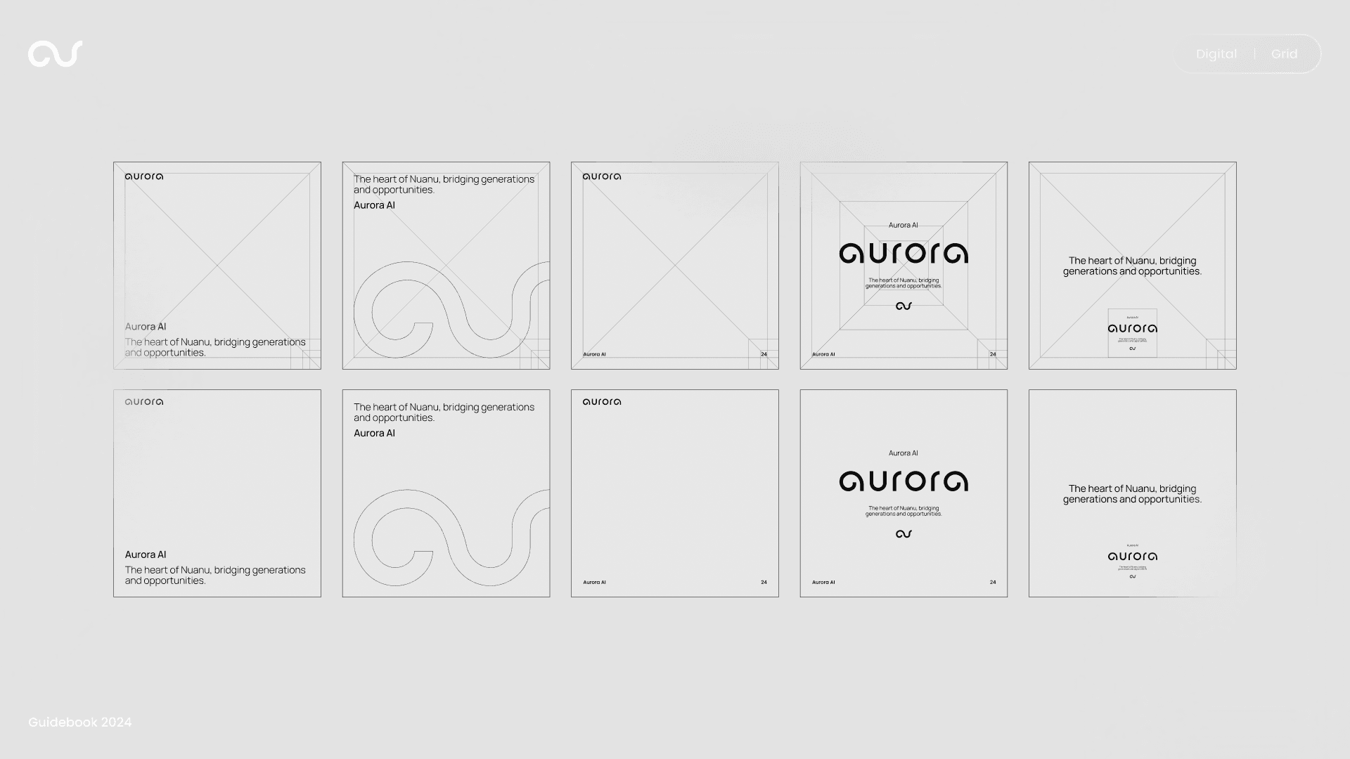
The decision was to build Aurora as a typographic system rather than a visual one. The same logic of rounded, half-circle letterforms that gives Nuanu its mark was extended into a wordmark for Aurora, close enough to read as family, distinct enough to read as its own. Type became the connective tissue between a chat bubble, a wall projection, and a voice agent's introduction.
This made the identity portable in a way a logo-led system would not have been. The same brand could surface in a 3D installation, on a phone screen, in a property contract, or inside a wedding venue, and still be recognised as Aurora.
Design
A custom wordmark built on the same half-circle geometry as Nuanu's logo, with a stand-alone "au" monogram that reads as a continuous loop.
A restrained palette: deep black grounding the brand across surfaces, with a single cyan-to-teal gradient used as a signal of presence, not as decoration.
Type used in two voices: a clean sans for utility and dialogue, the custom wordmark for moments where Aurora speaks as itself.
A modular product architecture covering chat, events, venues, and quests, built on a shared component system so each module could grow independently without breaking the whole.
A full identity system documented end-to-end: brand book, application design, website, and the visual logic for the park installation.
A 3D avatar developed in collaboration with Nikita Replyanski, used as Aurora's body in spatial contexts where pure typography wasn't enough.
Outcome
The Aurora identity now lives in Aurora Park inside Nuanu, where visitors can speak with the AI through an interactive installation, and the wordmark anchors the experience across signage, projections, and audio cues.
The web product (aurora.nuanu.com) and full brand system are complete and documented. The broader Aurora programme, including sales agents, butlers, and AI musicians, was scoped, designed, and paused as the parent organisation reprioritised. What was built remains in use. What was paused was left in a state ready to resume.
Six months of work, one designer, end-to-end identity from a wordmark to a working product.